Koffeinbolaget / Sweden
A clearer path to each product
A responsive Shopify storefront that brings Koffeinbolaget's brand, specialist range and buying journey into one coherent ecommerce system.
Results
One path from range to product
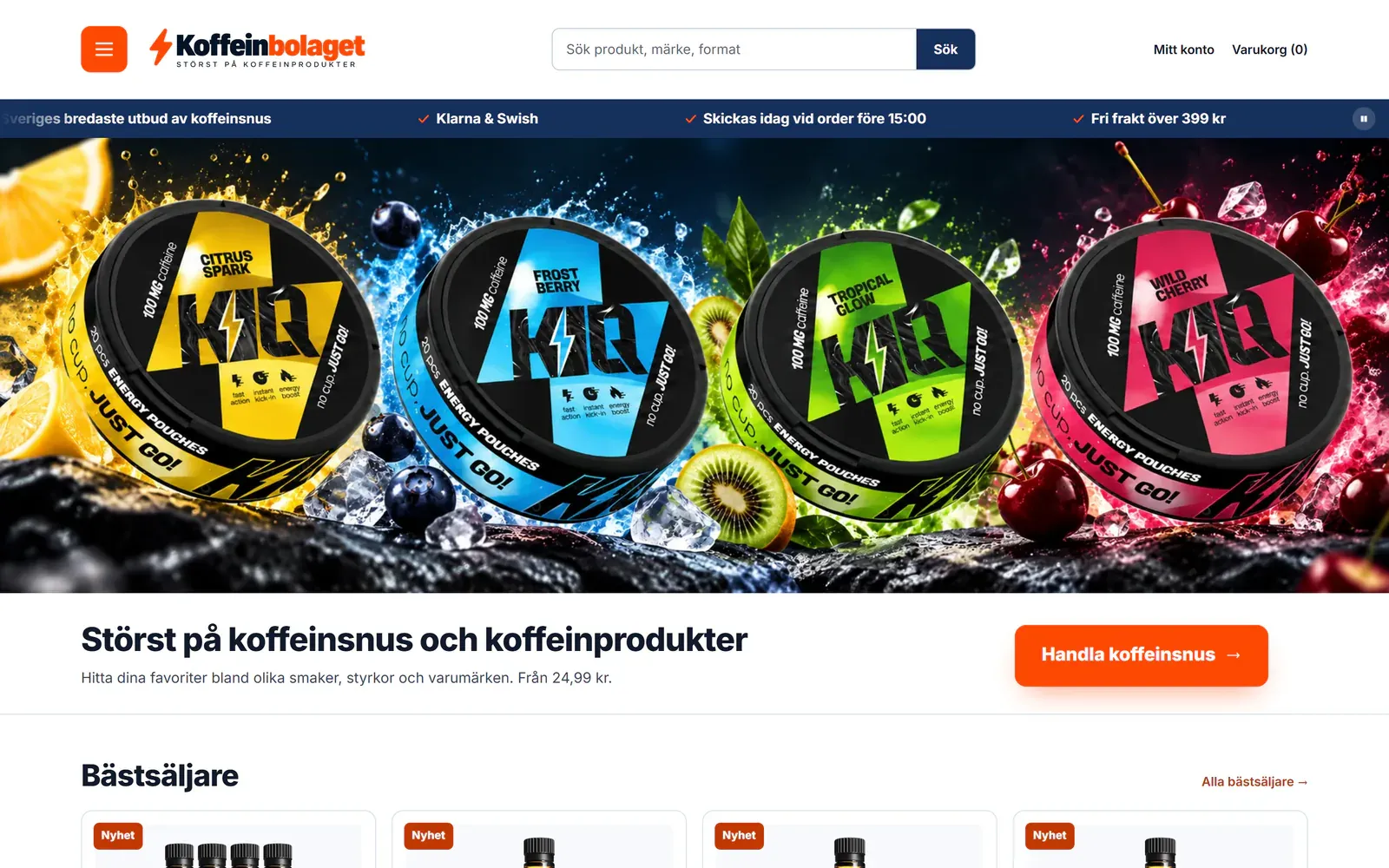
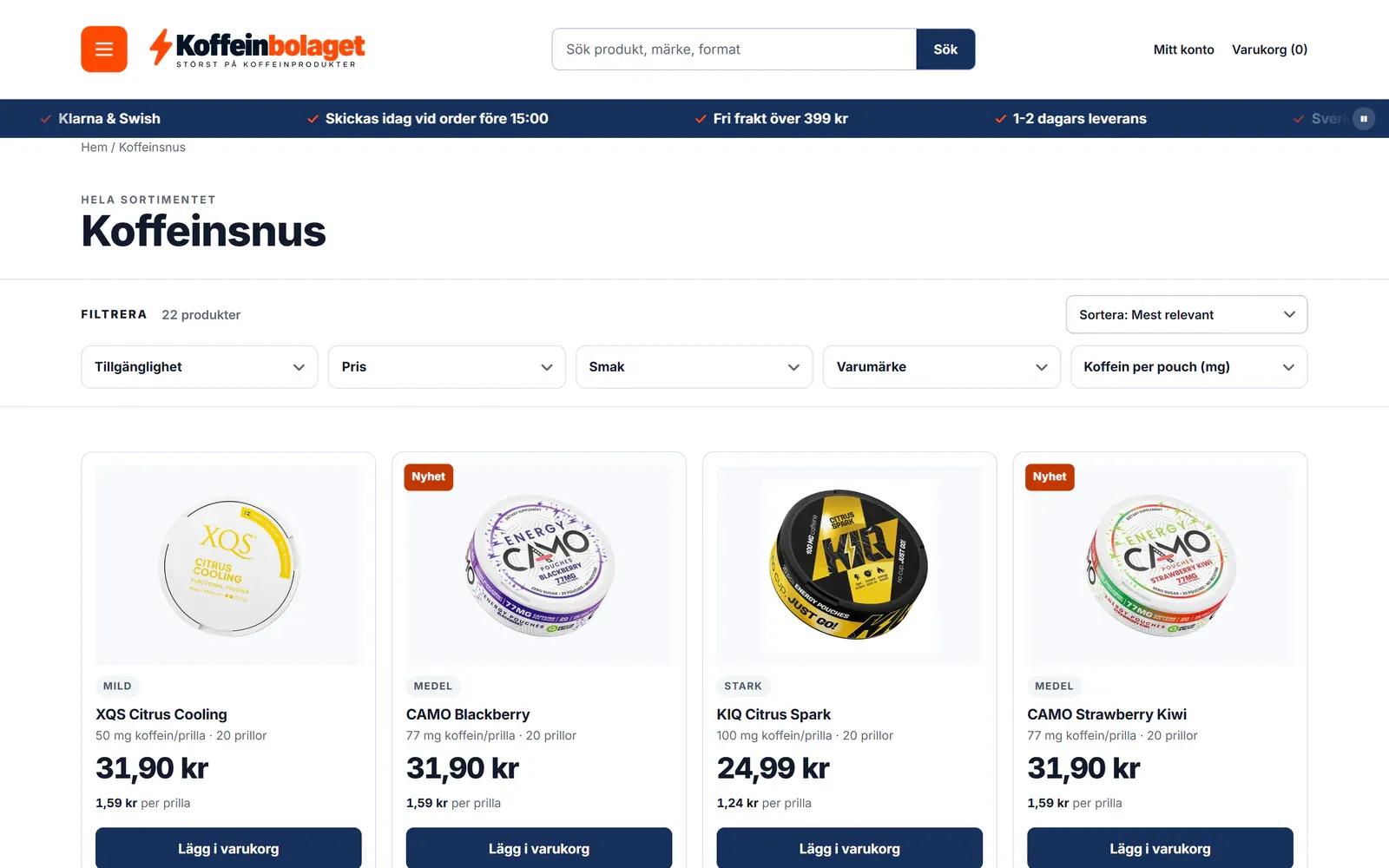
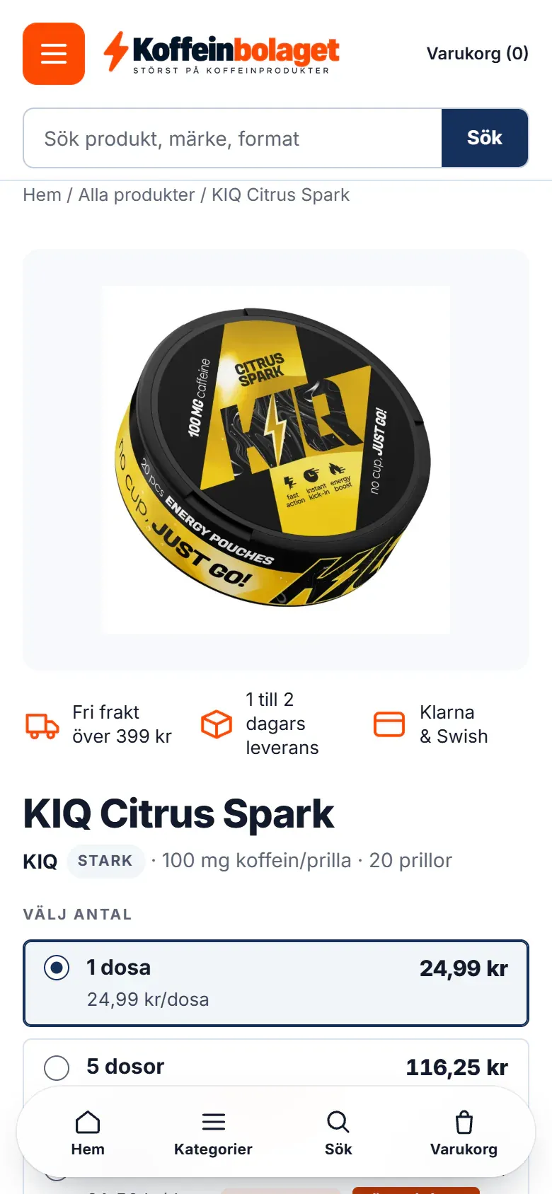
The storefront connects search, filters, product information and buying controls in one responsive journey, from a broad category to a specific item.
 View full image
Qualitative delivery evidence from owner-supplied public-storefront screenshots. No commercial or search-performance figures are claimed.
The challenge
A simpler way to compare products
Koffeinbolaget brings multiple caffeine-product brands, flavours and strengths into one specialist Swedish store. The experience needs to make that range easy to scan and compare, on a wide screen or a phone.
Product discovery. Customers need to compare flavour, brand, strength, price and availability across a growing assortment.
Buying confidence. Product pages need to explain strength, pack size, quantity pricing, delivery and payment before shoppers add an item to their cart.
Responsive commerce. Search, navigation, filters and buying controls need to remain clear on a phone as well as a desktop.
What we changed
From search to purchase
We brought the brand, product range and purchase journey into one system, using visual cues and practical ecommerce structure to help people move from a broad category to a specific item.
Built a recognisable retail system. A consistent navy, orange and white identity carries through the header, calls to action, assurance row and product cards.
Structured product discovery. Search, category filters and readable product cards help shoppers narrow the range by practical attributes.
Joined discovery to purchase. Shopify product pages connect product information, quantity choices, delivery assurances and a clear add-to-cart action.
Your next move
Tell us what you are trying to change. We will be direct about scope, evidence and whether we are the right fit.
Next case study